📊 Business Insights Dashboard
These QuickSight visuals show how end-users engage with the platform. They're driven by aggregated Gold-layer features from Athena queries.
1. Click vs Purchase Events per User
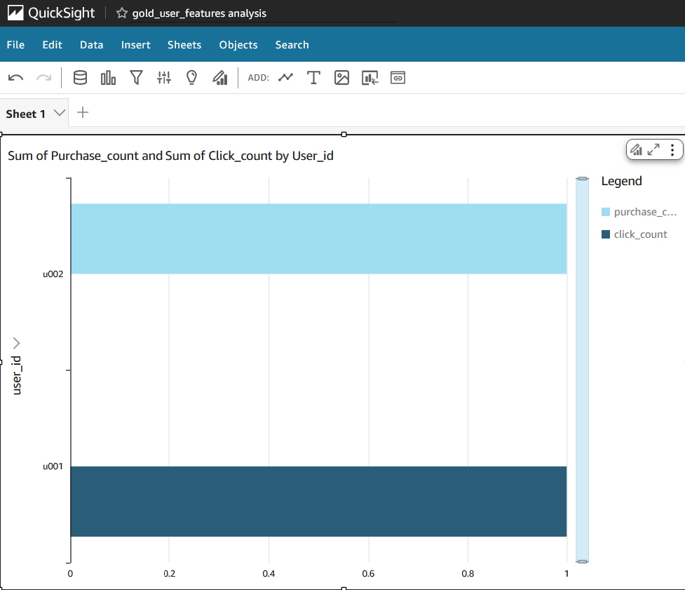
Bar chart comparing click and purchase behavior by user ID. Useful for funnel and conversion analysis.
2. Recent Activity by User
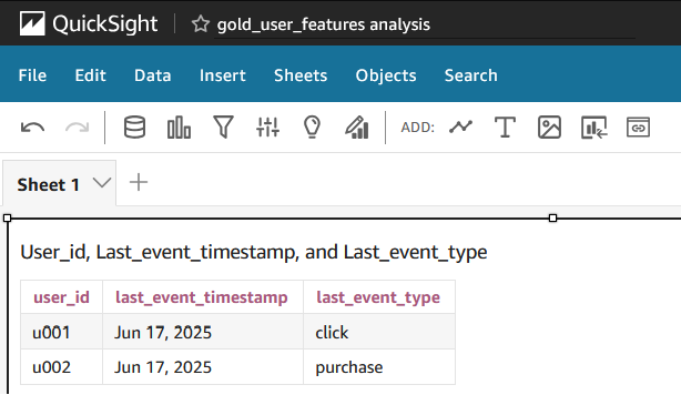
Table showing the most recent event type and timestamp per user, pulled from the Gold layer.
3. Recency Histogram
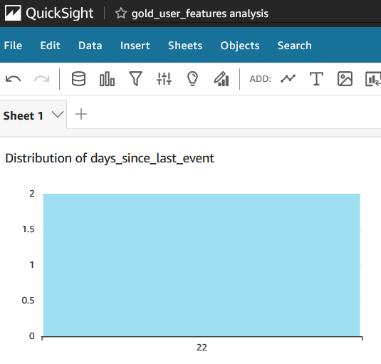
Histogram of days since last event. Helps understand how often users return or churn.